
Seemingly small changes in UI can have a big impact on user behaviour. In this age, people value the quality of their user experience like never before.
The competition always improves their UX and if you want to keep up with them, you should too.
So, what should we focus on?
First of all, less is more.
Structure and order are key to a successful dashboard.
Keep it tidy, just like your wardrobe, to find everything you need.
Now, let’s look at 3 hands on tips to improve the UX of your data heavy dashboard:
Choose the right font
When designing a dashboard that displays a lot of data, it's important to consider the readability and legibility of the text.
Choosing the appropriate font can greatly affect how easy it is to read and interpret the data presented.
In general, a font size of 16px is a good reference value for body text.
This size is large enough to be legible, even at a glance, but still compact enough to fit a lot of information on the screen.
It's important to strike a balance between legibility and space usage, especially in a dashboard where there may be a lot of information to display.
Additionally, choosing a relatively condensed font can help save space and make the text more compact.
More extended fonts may look cool for marketing purposes or other design elements, but can take up more space and make it harder to fit all the necessary information on the screen.

By choosing a font that is both legible and condensed, you can create a dashboard that is easy to use and provides a good user experience.
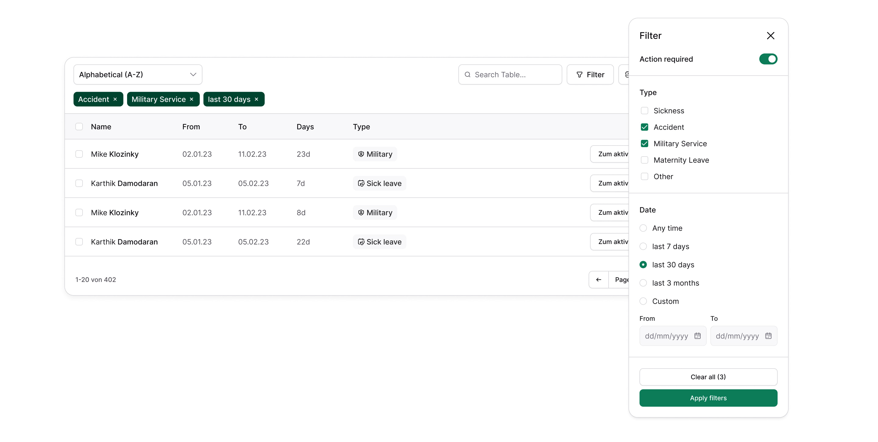
Table navigation should be easy
As we have described, fewer options on one screen generally lead to better user experience.
But sometimes a lot of data needs to be displayed at once.
Don’t worry, your customers will not get irritated if you can organize the information well. Make sure it’s easy to interact with your tables.
Just listing all the data is often not sufficient – especially if the user has to interact with the individual data entries.
A quick win is to include a sorting functionality inside the table’s header or/and make it searchable.
Differentiate between primary, secondary and tertiary actions
When designing a user interface, it's important to make it clear to the user what their primary options are for interacting with the interface.
One way to do this is by designating one or two primary call-to-action buttons that stand out from other buttons or elements on the page.
This can help guide the user towards taking the desired actions and avoiding confusion.
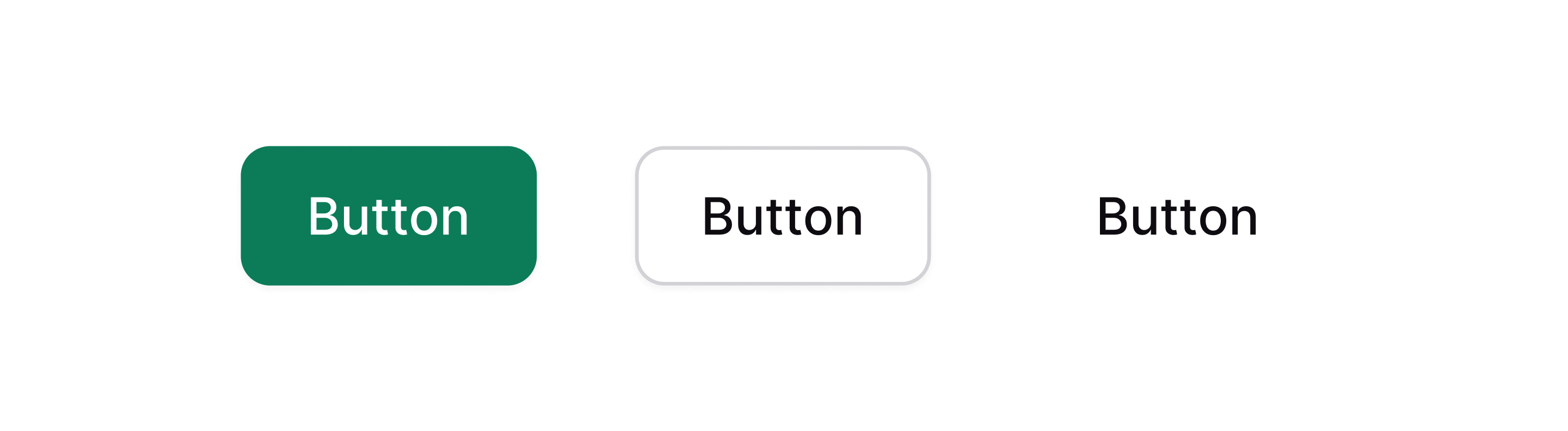
Having too many primary buttons or making them difficult to distinguish from other elements on the page can lead to a cluttered and confusing user interface.
By limiting the number of primary buttons and making them clear and prominent, users are more likely to understand what actions are expected of them and have a better overall experience with the interface.
As we have discovered in this blog post, simplicity, the right font and a well established table navigation are the key for a successful user experience of data heavy dashboards.
We hope, we brought you some useful information and wish for great implementation.
Let's get busy and make tools people will love!